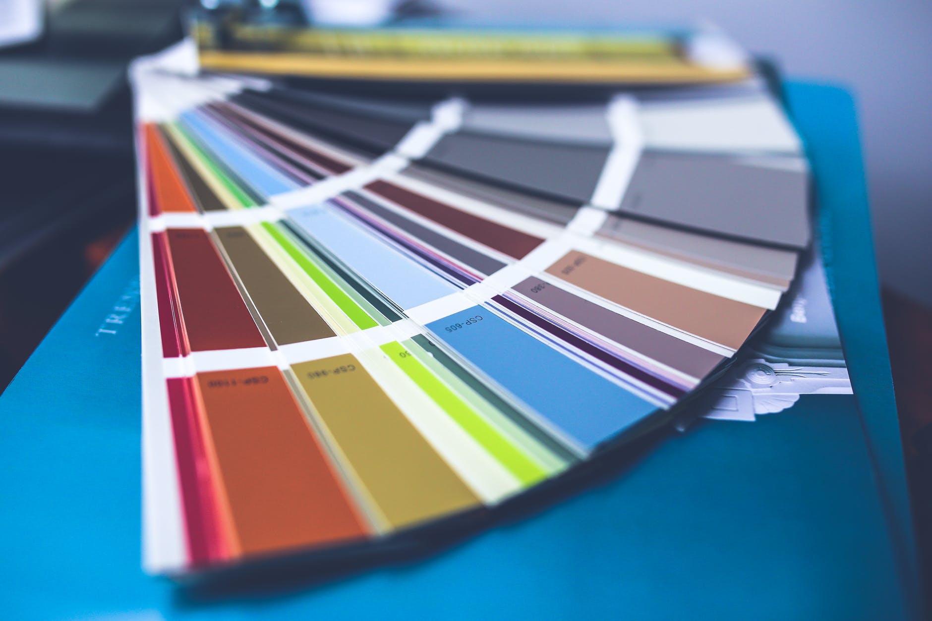
The last time the look and feel of the site was changed was back in 2020. A lot has happened since then. I am once more considering updating the look.
I want to make The Muse of Last Resort easy to browse for ideas. While I like the coloured previews on the front page, I feel the images that go with the prompts work better. Thus I am looking at making some changes.
The change is likely to be an entirely new theme. Not one written from scratch – I’d prefer to use one that already exists.
What are your thoughts on how the site looks? What would you change? What do you think we should keep? Let me know your thoughts in the comments.


Leave a Reply
You must be logged in to post a comment.